This article is about using CF7 Skins Ready in the Contact Form 7 tag editor. To learn about using CF7 Skins Ready in the CF7 Skins visual editor, see CF7 Skins Ready (with Visual Editor).
CF7 Skins Ready provides a range of useful, pre-defined styles (like evenly spaced columns & and several fields on a single line) that can be used in all CF7 Skins forms.
Add common stying options quickly & easily
CF7 Skins Ready includes the following Ready Classes:
- box – displays enclosed elements in a surrounding box
- column – displays enclosed elements in a vertical column
- grid – implements a strict form grid
- singleline – displays enclosed elements on a single line
- horizontal – displays checkboxes & radio buttons in horizontal line

You can use our CF7 Skins Ready classes right away without having to write any of your own CSS.

Using Ready Classes
Ready Classes are class names that you can add to form field to take advantage of these pre-defined styles.
You can use the traditional CF7 form editor to add these pre-defined styles to your form.
<fieldset>
	<legend>singleline</legend>
	<ol class="singleline">
		<li> tel [tel cf7s-tel-01 15/] </li>
		<li> mobile [tel cf7s-tel-02 15/] </li>
	</ol>
</fieldset>
To add a Ready Class, using the traditional CF7 form editor, you need to edit your form in the Form section of the CF7 interface.

You can add a Ready Class to an individual form field or a group of form elements by adding the Ready Class to the surrounding parent element.
	<ol class="singleline">
		<li> .. </li>
		<li> .. </li>
	</ol>
You can also use multiple classes together – just separate each class name by a space.
	<ol class="singleline box">
		<li> .. </li>
		<li> .. </li>
		<li> .. </li>
	</ol>
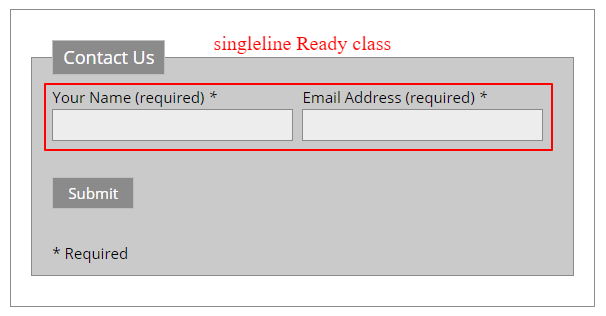
singleline
Displays enclosed elements on a single line
Form
<fieldset>
	<legend>singleline</legend>
	<ol class="singleline">
		<li> tel [tel cf7s-tel-01 15/] </li>
		<li> mobile [tel cf7s-tel-02 15/] </li>
	</ol>
	<ol class="singleline box">
		<li> Item1 [[text item1a]] </li>
		<li> Dropdown Menu [select cf7s-menu-01 multiple include_blank "Item1" "Item2" "Item3"] </li>
		<li> Item2 [[text item2a]] </li>
	</ol>
</fieldset>
Using Singleline
You can group several form elements into a single line by simply adding a singleline Ready Class to the surrounding parent element.
As CF7 Skins uses ordered lists < ol > as the foundation of all CF7 Skins Templates and adds individual form fields in list < li > elements, you simply need to add the singleline Class to the surrounding ordered list parent element.
	<ol class="singleline">
		<li> .. </li>
		<li> .. </li>
	</ol>
Tip:
- Fields within singleline are automatically evenly spaced by CF7 Skins Ready. If you want more control over individual field widths you should use the grid Ready Class.
- CF7 Skins uses Fieldset, Legend & Lists as the foundation of all CF7 Skins forms.
- It’s a really good idea to use tabs to keep all your fields indented to show how they are grouped.
column
Displays enclosed elements in a vertical column
Form
<fieldset>
	<legend>column</legend>
	<ol class="column">
		<ol>
			<li> <strong>Ready Class column</strong> </li>
			<li> Item1 [[text item1a]] </li>
			<li> Dropdown Menu [select cf7s-menu-01 multiple include_blank "Item1" "Item2" "Item3"] </li>
			<li> Item2 [[text item2a]] </li>
		</ol>
		<ol>
			<li> <strong>Ready Class column</strong> </li>
			<li> Item1 [[text item1b]] </li>
			<li> Item2 [[text item2b]] </li>
			<li> Item3 [[text item3b]] </li>
			<li> Dropdown Menu [select cf7s-menu-01 multiple include_blank "Item1" "Item2" "Item3"] </li>
		</ol>
	</ol>
	<ol class="column box">
		<ol>
			<li> <strong>Ready Class column</strong> </li>
			<li> Item1 [[text item1c]] </li>
			<li> Item2 [[text item2c]] </li>
			<li> Item3 [[text item3c]] </li>
			<li> Dropdown Menu [select cf7s-menu-01 multiple include_blank "Item1" "Item2" "Item3"] </li>
		</ol>
		<ol>
			<li> <strong>Ready Class column</strong> </li>
			<li> Item1 [[text item1d]] </li>
			<li> Dropdown Menu [select cf7s-menu-01 multiple include_blank "Item1" "Item2" "Item3"] </li>
			<li> Item2 [[text item2d]] </li>
		</ol>
		<ol>
			<li> <strong>Ready Class column</strong> </li>
			<li> Item1 [[text item1e]] </li>
			<li> Item2 [[text item2e]] </li>
			<li> Item3 [[text item3e]] </li>
			<li> Dropdown Menu [select cf7s-menu-01 multiple include_blank "Item1" "Item2" "Item3"] </li>
		</ol>
	</ol>
</fieldset>
Using Column
To use the column Ready Class you should first setup an ordered list < ol > for each column you want in a group of ordered lists. You need to create a group of ordered lists for all the fields you want placed in columns.
		<ol>
			<li> .. </li>
			<li> .. </li>
		</ol>
		<ol>
			<li> .. </li>
			<li> .. </li>
			<li> .. </li>
		</ol>
Next add a surrounding parent ordered list < ol > and add a column Ready Class to the parent element.
	<ol class="column">
		<ol>
		..
		</ol>
		<ol>
		..
		</ol>
	</ol>
Tip: All columns are automatically evenly spaced by CF7 Skins Ready. If you want more control over individual column widths you should use the grid Ready Class.
grid
Implements a strict form grid
Form
<fieldset>
	<legend>grid (with grid-hover & grid-lined)</legend>
	<ol class="grid grid-hover grid-lined">
		<ol data-row-span="1">
			<li data-field-span="1"> Field 1 [[text item-g1a]] </li>
		</ol>
		<ol data-row-span="2">
			<li data-field-span="1"> Field 1 [[text item-g1b]] </li>
			<li data-field-span="1"> Field 2 [[text item-g2b]] </li>
		</ol>
		<ol data-row-span="3">
			<li data-field-span="1"> Field 1 [[text item-g1c]] </li>
			<li data-field-span="1"> Field 2 [[text item-g2c]] </li>
			<li data-field-span="1"> Field 3 [[text item-g3c]] </li>
		</ol>
		<ol data-row-span="4">
			<li data-field-span="1"> Field 1 [[text item-g1d]] </li>
			<li data-field-span="1"> Field 2 [[text item-g2d]] </li>
			<li data-field-span="1"> Field 3 [[text item-g3d]] </li>
			<li data-field-span="1"> Field 4 [[text item-g4d]] </li>
		</ol>
		<ol data-row-span="5">
			<li data-field-span="1"> Field 1 [[text item-g1e]] </li>
			<li data-field-span="1"> Field 2 [[text item-g2e]] </li>
			<li data-field-span="1"> Field 3 [[text item-g3e]] </li>
			<li data-field-span="1"> Field 4 [[text item-g4e]] </li>
			<li data-field-span="1"> Field 5 [[text item-g5e]] </li>
		</ol>
		<ol data-row-span="3">
			<li data-field-span="2"> Field 1 [[text item-g1f]] </li>
			<li data-field-span="1"> Field 2 [[text item-g2f]] </li>
		</ol>
		<ol data-row-span="3">
			<li data-field-span="1"> Field 1 [[text item-g1g]] </li>
			<li data-field-span="2"> Field 2 [[text item-g2g]] </li>
		</ol>
		<ol data-row-span="4">
			<li data-field-span="1"> Field 1 [[text item-g1h]] </li>
			<li data-field-span="2"> Field 2 [[text item-g2h]] </li>
			<li data-field-span="1"> Field 3 [[text item-g3h]] </li>
		</ol>
		<ol data-row-span="4">
			<li data-field-span="2"> Field 1 [[text item-g1i]] </li>
			<li data-field-span="1"> Field 2 [[text item-g2i]] </li>
			<li data-field-span="1"> Field 3 [[text item-g3i]] </li>
		</ol>
		<ol data-row-span="4">
			<li data-field-span="3"> Field 1 [[text item-g1j]] </li>
			<li data-field-span="1"> Field 2 [[text item-g2j]] </li>
		</ol>
	</ol>
</fieldset>
Using Grid
Using a grid is very powerful and quite intuitive once you get a handle on it.
grid:
Create a grid by giving a surrounding parent < ol > or < div > element a grid class to turn the enclosed area into a grid.
	<ol class="grid">
		..
		..
		..
	</ol>
Optionally add grid-hover and grid-lined to add these features to your grid.
	<ol class="grid grid-hover grid-lined">
		..
		..
		..
	</ol>
rows:
Your grid has a number of rows.
Set a < ol > element with the data-row-span attribute to make a row. Set the attribute value to the total number of columns you want in this row – 2 to divide it into 2 columns, 3 to divide it into 3 columns and so on.
	<ol class="grid grid-hover grid-lined">
		<ol data-row-span="4">
			..
			..
		</ol>
	</ol>
fields:
Each row has a set of fields.
Set up the enclosed < li > field elements with data-field-span attribute values equal to the number columns you want it to occupy within the row – set to “1” the field spans 1 columns, set to “2” the field spans 2 columns etc.
	<ol class="grid grid-hover grid-lined">
		<ol data-row-span="4">
			<li data-field-span="3"> Field 1 [[text item-g1]] </li>
			<li data-field-span="1"> Field 2 [[text item-g2]] </li>
		</ol>
	</ol>
Note: The total number columns you set in the fields data-field-span attribute should add up to the value set for data-row-span in the enclosing row.
Tip:
- You can use the CF7 Skins Pro Grid Pro Template to help you get started building a CF7 Skins form based on a strict grid. Then you can copy, add, remove and alter fields to customize the form to suit your needs.
- You can use the grid Ready Class to give you control over individual column widths within a form.
box
Displays enclosed elements in a surrounding box
Form
<fieldset>
	<legend>box</legend>
	<ol class="box">
		<ol class="singleline">
			<li> Item1 [[text item1a]] </li>
			<li> Dropdown Menu [[select cf7s-menu-01 multiple include_blank "Item1" "Item2" "Item3"]] </li>
			<li> Item2 [[text item2a]] </li>
		</ol>
	</ol>
</fieldset>
Using Box
You can add a box Ready Class to a group of form elements by simply adding the box Class to the surrounding parent element.
	<ol class="box">
		<li> .. </li>
		<li> .. </li>
	</ol>
You can add a box Ready Class to single or multiple ordered lists < ol >.
	<ol class="box">
		<ol>
		..
		</ol>
		<ol>
		..
		</ol>
	</ol>
checkbox & radio buttons – horizontal
Displays checkboxes & radio buttons in horizontal line
Form
<fieldset>
	<legend>checkbox & radio buttons - horizontal</legend>
	<ol>
		<li class="checkbox-horizontal">Checkboxes (<strong>Ready Class checkbox-horizontal</strong>)
		 [checkbox cf7s-checkbox-02 "Item1" "Item2" "Item3" "Item4"] </li>
		<li  class="radio-horizontal">Radio Buttons (<strong>Ready Class radio-horizontal</strong>)
		 [radio cf7s-radio-02 label_first use_label_element "Item1" "Item2" "Item3"] </li>
	</ol>
</fieldset>
Using checkbox & radio buttons – horizontal
CF7 Skins displays all checkbox & radio buttons in a vertical list by default.
Add the checkbox-horizontal or radio-horizontal Ready Class to individual list < li > elements containing checkbox & radio buttons tags to display checkbox or radio buttons in a horizontal list.
	<ol>
		<li class="checkbox-horizontal">Checkboxes horizontal
		 [checkbox cf7s-checkbox-02 "Item1" "Item2" "Item3" "Item4"] </li>
	</ol>
You need to select one of our CF7 Skins Styles
For CF7 Skins Ready to work you need to select one of our CF7 Skins Styles.
We recommend you initially select the Default Style which is the minimum needed to support CF7 Skins Ready.

This lets you see what your form looks like with CF7 Skins Ready added to form styling applied in your current WordPress theme.
You can also pick any of other CF7 Skins styles, which will give significantly more detailed styling of your form.
Demo Form
You can complete the form below to see a range of CF7 Skins Ready classes in action.
Requirements
- Requires at least Contact Form 7 Skins v1.1.1
- You’ll get more comprehensive styling if you select one of our CF7 Skins Templates (rather than the default Contact Form 7 layout) to work together with one of our CF7 Skins Styles
- Requires the CF7 Skins Pro plugin to operate – you will need to also purchase the CF7 Skins Pro plugin to use the CF7 Skins Ready Add-on
- Requires the libxml PHP extension on your server
libxml PHP extension
CF7 SKins Ready requires the libxml PHP extension to installed on your WordPress hosting and the DOM/XML module enabled. This is commonly available on most basic WordPress hosting.
You can check if this extension is available on your WordPress hosting server by following this steps:
a. In the public_html folder of your site, create a file named phpinfo.php.
b. Insert the following code into the phpinfo.php file:
c. Open an internet browser and type the following into your browser’s address bar:
http://example.com/phpinfo.php
Be sure to replace “example.com” with your actual domain.
d. Find libXML support in the page and make sure it says active
e. Find DOM/XML in the page and make sure it says enabled
There is a WordPress plugin that can display the current server information:
https://wordpress.org/plugins/wordpress-php-info/